It was bound to happen. There is no way I was going to get away with painting nine rooms (if you count the hall as a room) without making a fatal paint choice error.
I’m painting the living room this week (I’m on vacation, and we are having a housewarming party soon, so I’m anxious to get the public rooms finished.) I had originally thought that I might paint this room yellow, but the room has a problem. Problem #1 is that it is a sort of loft area, overlooking the stairwell and flowing into the upstairs hall, so whatever I use has to work in several areas. Problem #2 is that when the previous owners opened up this room they built a new stairwell… out of yellow pine (the rest of the house is a mix of red oak and tiger oak.) The yellow pine is crazy orangey, and any sort of warm shade tends to emphasize the orange, and the fact that it does not even match the rest of the stairwell.
I had decided on a sage green, which I thought would look nice with my red sofa and the blue fireplace, and which wouldn’t be overwhelming carried into the hall. I only got as far as the window before I knew I hated it, but I continued on for another wall to make sure. Yup… instead of the pretty sage on the card, this color looked like a gray-ish mint on the walls.
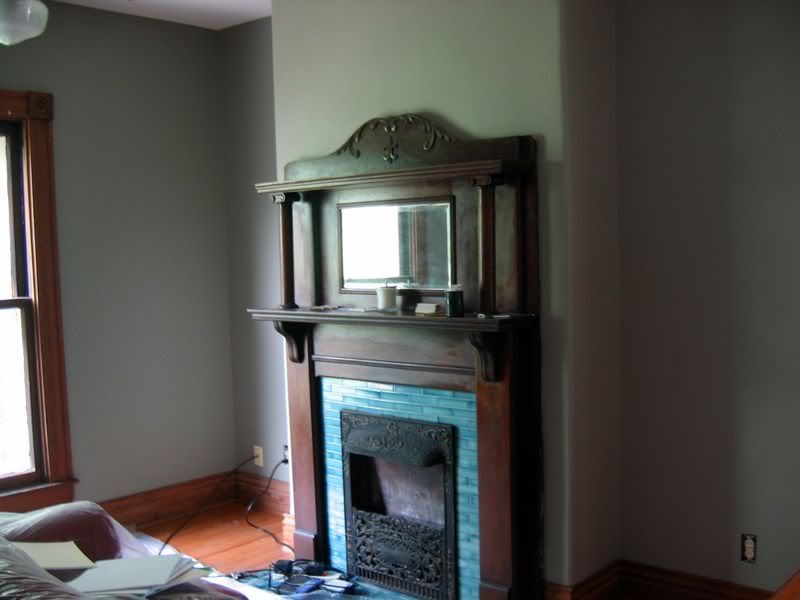
This picture actually just looks gray, but trust me that the mint was there. It’s actually a nice color, but in my opinion it would look better with white trim. It really gave the room a cold feel, which wasn’t what I wanted for our private living area.
I was sad because I really do love this color, but it isn’t for our home.
I decided to give the leftovers to my Mom, who is repainting her house to sell it, and started going through the huge pile of samples I have amassed, looking for a color that might work.
I threw a few up on the wall:
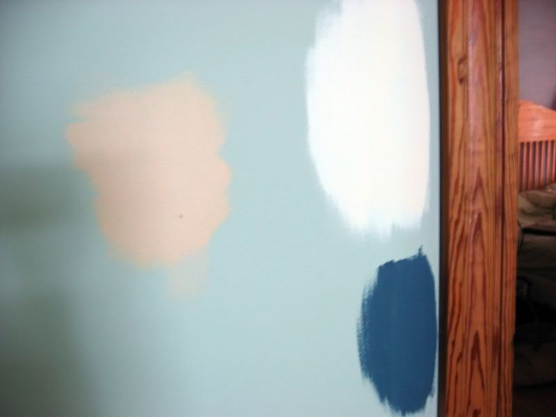
Yup, I still don’t like yellow. But that blue… it had possibilities, although it looks a little bland in this photo. It’s from the Sherwin Williams Arts and Crafts Collection. The color is “Bunglehouse Blue.” I decided to go with my instincts, so I went with the blue, which happens to go well with the fireplace.
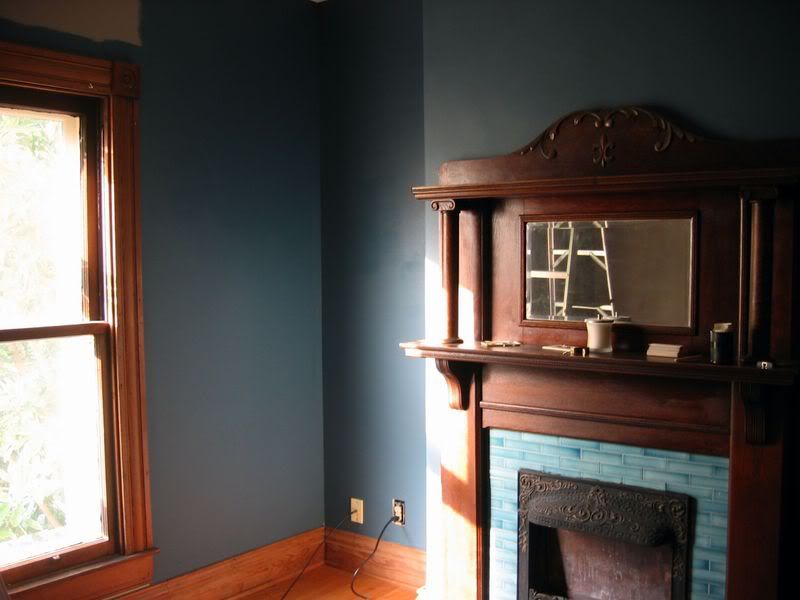
Perfect! The darker color makes the wood glow, and this blue contains enough green to avoid feeling cold with the northern light. I need to learn to go with my instincts – I knew that light colors didn’t look great with our woodwork, but I was worried about the house being a cave. Strangely enough, dark colors seem to work better with the dark trim. I think it has to do with the amount of contrast.
While I was painting I discovered what color the room was painted before the owners painted to sell last year – ballerina pink. Wow… I really cannot imagine thinking that was a good idea, but then these are the same people who repainted to sell using only mint green and butter yellow, and without using any drop cloths on the wood floors.
I had been considering using more muted colors for the bedrooms upstairs (I hope to get to those labor day weekend) but I have changed my mind based on this experience.
These are the colors I picked up today to think about for our bedroom (yes, I know I’m indecisive, you are all thinking “Didn’t she already go through this?”) I like the two on the far left, Martha Stewart Terrarium and Ralph Lauren Alpine Pool.
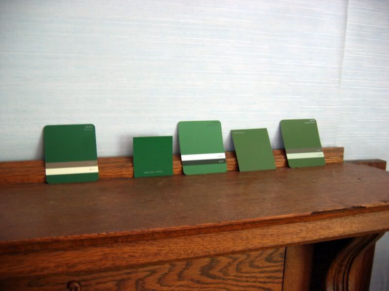
The guest room will actually be next, and I am deciding between a Martha color called “chalkboard green” and an eddie bauer color called “bordeaux.” We will not talk about how many swatches are currently on the walls. I clearly have a paint problem.
Tomorrow this room will get a second coat (I am so pleased with the coverage of this paint, Sherwin Williams Cashmere) and then I will have a living room again. I have hardly been able to knit, and I am so close to being finished with Honey. Last summer I took over a month to complete the Nantucket Jacket because of the wedding, and this summer I am taking ages to finish anything because of the house – it must be something about july and august! I cannot wait for colder weather…

The sage green looks almost institutional to me so I was relieved to see you decided against it. The blue is perfect! Good instincts you’ve got there (I wish I could find yarn in that color). Anything lighter would have made the room look washed out. As for the green, I’m more partial to the two muted ones on the far right but any of them would look great. I love seeing someone who isn’t afraid of color do over their house, it’s great fun. 🙂
I’m really enjoying watching you transform your home! I agree with Christina, it’s fun seeing you go with all these bold colours.
The saturated colours really sing in your house, it looks wonderful. Looking forward to seeing your bedrooms newly painted. You’ve got me inspired, I’ve got paint swatches stuck up all around my house again too.
This is such a wonderful adventure! I like the middle green if the screen color is accurate:) It’s got a very mellow feel to it. And I laughed when you said it took you a whole month to finish your Nantucket Jacket…it took me almost a year! Good luck with finding colors for you bedroom and guest room
That bunglehouse looks absolutely fabulous! We painted our entry way three times in various yellow/golds and everytime it looked like cheese. Ugh. So we went with the same color as our living room and called it a day. Painting is hard. I vote for terrarium, but really I can’t tell, it just has a great name =).
Good luck with the housewarming! I’ve had a hard time knitting and watching the Olympics (lace and sports do not go well together), throw in a new house and forget it!
Swatches are free; paint is not. Swatch away!
I love the rich colors in your house. I think you’re right about the woodwork needing dark colors. I also think the clear colors look better than the muted ones.
You’re making me want to repaint. Again. In the last go-round, I edited out most of my wall color (since I have lots of color in my furnishings) and ended up with mostly cream and sage green on the walls. But now I’m thinking I should brighten things up a little.
Love the blue! It’s very similar to the blue that is in my current kitchen. I like it so much I might use it as a color in the new house. We haven’t gotten to paint colors yet. I also like the more muted greens.
Wow. That blue looks great. From the sample, I thought it would be too dark, but it’s really beautiful.
As to the green, I prefer the one on the far left. I would avoid the one second from the left. We originally tried a color very much like that, and what looks beautiful and vibrant in a little square looks disturbingly like aquarium mold when up on a wall. It seems you want to pick something a little grey-er than you think you want when choosing a dark green paint.
Of course, you’ve already demonstrated a much better eye than I had. Only one miss out of nine rooms? We only had one of our first tries work out (on three rooms) and one of them we had to retry twice!
Looks like a before and after shot for one of those makeover shows – a sort of ‘what not to paint’ 🙂
Oh horror! It’s so dreadful to repaint, but at least you had everything prepped and ready to go. The blue looks fabulous, so good for you for rallying and getting it done!
The blue looks great! It really enhances the tile on the fireplace and goes great with the wood. I admire your color courage. It’s really paying off. I think it’s giving me some courage to try some colors I love instead of trying to be “safe”. Thanks! Good luck with the bedroom color. I can’t wait to see how it turns out.
That’s a great blue. I can’t wait to see pics of everything all pulled together
The colors are looking fabulous! I especially like how the blue brings out the fireplace- very nice! It’s fun checking in here every couple of days to see how it’s going. It’s giving me a few ideas for my place.